| Author: |
|
| Views Total: |
5,958 |
| Official Page: |
Go to website |
| Last Update: |
January 28, 2015 |
| License: |
MIT |
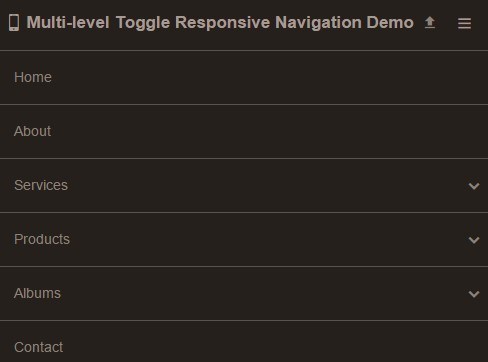
Preview:
Description:
A pure CSS mobile-friendly navigation that automatically transform your horizontal navigation into a toggleable vertical accordion menu on smaller screen devices, with support for unlimited sub menu items.
How to use it:
Load the required navigation.min.css in the head section of your document.
1 | <link rel="stylesheet" href="css/navigation.min.css"> |
Add the CSS class nav-no-js to the Html tag.
1 | <html lang="en" class="nav-no-js"> |
Create a nav toggle button that only appears on mobile devices.
1 | <div class="nav-button"></div> |
Create your navigation menu using nested Html lists.
03 | <li><a href="#">Home</a></li> |
04 | <li><a href="#">About</a></li> |
05 | <li class="submenu"><a href="#">Services</a> |
07 | <li><a href="#">Some Service</a></li> |
08 | <li><a href="#">Another Service</a></li> |
09 | <li><a href="#">Good Service</a></li> |
10 | <li><a href="#">Room Service</a></li> |
13 | <li class="submenu"><a href="#">Products</a> |
15 | <li><a href="#">Food</a></li> |
16 | <li class="submenu"><a href="#">Drinks</a> |
18 | <li><a href="#">Water</a></li> |
19 | <li class="submenu"><a href="#">Cola</a> |
21 | <li class="submenu nav-left"><a href="#">Coca Cola</a> |
23 | <li><a href="#">This one goes left!</a></li> |
24 | <li><a href="#">Too much sugar...</a></li> |
25 | <li><a href="#">Yummy</a></li> |
28 | <li><a href="#">Pepsi</a></li> |
29 | <li><a href="#">River</a></li> |
32 | <li><a href="#">Lemonade</a></li> |
35 | <li><a href="#">Candy</a></li> |
36 | <li><a href="#">Ice Cream</a></li> |
39 | <li class="submenu"><a href="#">Albums</a> |
41 | <li><a href="#">Christmas</a></li> |
42 | <li><a href="#">New Year</a></li> |
43 | <li><a href="#">Easter</a></li> |
46 | <li><a href="#">Contact</a></li> |
Create a close button to dismiss the accordion menu on mobile devices.
1 | <div class="nav-close"></div> |
See Also:
 Minimal Responsive Dropdown Navigation In Pure CSS Posted in CSS & CSS3, Menu & Navigation
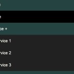 Pure CSS Mobile-compatible Responsive Dropdown Menu Posted in CSS & CSS3, Menu & Navigation
 Toggleable Dropdown Mobile Menu with KoalaNav.js Posted in Javascript, Menu & Navigation
 Responsive CSS Only Header Navigation – Luxbar Posted in CSS & CSS3, Recommended, Menu & Navigation
 Pure CSS Sliding Navigation For Mobile Posted in CSS & CSS3, Menu & Navigation
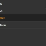 Responsive Drawer Navigation In Pure CSS Posted in CSS & CSS3, Menu & Navigation
 Responsive Show / Hide Navigation Menu with JavaScript and CSS3 Posted in Javascript, Menu & Navigation
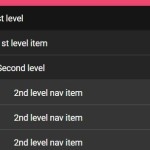 Multilevel Accordion Menu with Plain HTML & CSS Posted in CSS & CSS3, Menu & Navigation, Accordion